
Wednesday, September 14, 2011
Rhythm
This advertisement greatly displays the principle "Rhythm" for the reason that the nike ad shows there logo repeated vertically to show the observers how nike has came to be where it is today and how it has evolved. Also, because the shape of there check mark logo is the same size as it repeats itself demonstrating rhythm and repetition.

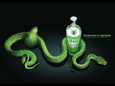
Unity/Harmony
This advertisement demonstrates "Unity/Harmony" in the six principles because these compositions create drama and interest through using everything green to promote the pear flavour. Also, because they used a green snake eating a pear, wrapped around the bottle and beside that they used there slogan and put the font in green to really blend with the ad.

Proportion
This advertisment shows a deminstration of "Proportion" because the pop can is the main focus in this image while the other shapes in the background are around it. Also, the pop of colour being light blue on the pop can really stands out from the rest of the image because the background is very dark purple's, green's, and blue's.


Tuesday, September 13, 2011
Emphasis
This advertisment represents the principle "Gradation" because from left to right the image of the girls face is very bright and fades away as you look to the right. The gradation from light to dark will cause the eye to move along a the image demonstrating colour contrast.


Contrast
This advertisement for Fendi displays the principle "Contrast" because in this ad it shows many colours such as the bright pink on the models lips, with the lime green dress and nail polish. Also, the background emphasizes all the colours together and makes her glasses and blonde hair stand out.


Balance
This advertisement is a well representation of one of the six principles of design "Balance" because the cube of blue chalk is evened out with the pool stick. The darker shape in this case would be the cube and the pool stick balanced it out because it is a lighter shade.


Subscribe to:
Comments (Atom)